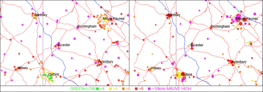
Guest blog by Gordon Stokes, Visiting Research Associate at Transport Studies Unit, University of Oxford
Finding the right places to locate large numbers of new homes and jobs in crowded areas of the South East will need great care if we’re trying to encourage modes other than the car. New mapping shows graphically how people travel to work using 2011 census data, which recorded people’s usual residence location, and where they normally worked, and also asked the main mode of transport that they used. It’s by far the best available data available for looking at how travel to work varies between areas, even though there are many caveats about its accuracy.
I’ve mapped the data in a number of ways, and have recently produced a ‘traffic light’ form of mapping that shows the areas where large amounts of car travel are generated, and where there is much less. The two maps below show the relative distance driven to work, for residents (left hand map) and for each job (right hand map).
Kilometres driven per resident (left) and per job (right) in Oxford to Milton Keynes area. Green circles show low mileage and red/mauve high.
Residents near the centre of Oxford are in the lowest quartile of distance driven (green) while those in Bicester are all in the highest quartile (red and violet). While Milton Keynes fares averagely for residents (yellow and amber), for jobs it creates mileage in the highest 10% (violet). And while central Oxford seems relatively sustainable the workplaces to the South and West produce high mileages.
The maps above are part of a series with commentary relating to the ‘Oxford-Cambridge Expressway’, a sort of outer M25 proposed which would come with 1 million extra homes built before 2050. You can interpret the maps in different ways, but to me they show that the problems of locating those homes and related jobs in a way that could be described as sustainable are immense. Oxford and Cambridge are unique in their makeup and ‘traditions’ of cycling, and it’s difficult to replicate that elsewhere. The maps can be viewed on my website. The pages take some time to load and are pretty useless on a phone, due to their complexity and scale – sorry about that if you’re a phone user!
You can remove the introduction and then view different layers of the map, and read about the patterns shown. More general national mapping can be found at the link at the bottom right, or here.
The Oxford-Cambridge maps show the difficulties for the proposed road and building, but other areas of the country show different issues. London’s well developed public transport network, large scale and centralised jobs (in conjunction with the impossibility of high numbers reaching the centre by car) shows that low driver mileage can be achieved there. Other major conurbations don’t fare so well, with strong centres and strong economy being a key issue. Residents in most large cities use cars less, but jobs in centres such as Leeds and Manchester with strong economies produce much more car travel than Liverpool, Hull, Blackpool and others. But it tends to be those with weaker economies and least developed public transport and least centrality that have the highest rate of travel by modes other than driving, active modes and public transport (which mainly means high levels of travel as a car passenger).
My next stage of this work will be to measure how factors such as distance from motorway, and relative concentration of jobs affects driver mileage, which may help provide better explanations for some of the ‘surprises’ in the maps. At the moment, from this mapping, it’s difficult to say how new development and sustainable travel can be synergetic – it just helps show where not to locate. Hopefully more analysis will provide some pointers as to where it should be.
Guest blog by Gordon Stokes, Visiting Research Associate at the Transport Studies Unit, University of Oxford